Nir’s Note: In this guest post, Ryan Hoover takes a look at Tinder, a red hot dating app. Ryan dives into what makes the Tinder app so popular and engaging. Ryan blogs at ryanhoover.me and you can follow him on Twitter at rrhoover.

The Tinder app has become a fixture in the U.S. App Store as one of the top 25 social networking applications, generating 1.5 million daily matches as more than 50 percent of its users login multiple times per day.
This isn’t luck. It’s smart design based in part, on game mechanics and an understanding of user psychology.
Here are four ways Tinder engages its calloused-fingered users:
Stupid Simple
Tinder demands very little of the brain. Tinder reduces cognitive overhead into a binary decision: swipe left (not interested) or swipe right (interested). Traditional dating sites provide several ways to express interest. OkCupid users can rate others 1-5 stars, send a message, or start a chat. More options provide greater freedom of expression, but also introduce more mental effort. “Is she a 3 or 4 star catch? Should I message her? If so, what should I say?” These are questions guys and gals ask themselves before taking action. Increasingly, technology consumers multitask, fiddling with their “second-screen” while watching TV and chatting with friends. In turn, this decreases how often users engage with products that demand their full attention. By requiring less mental energy, Tinder users are more apt to use the service throughout the day.
Tinder also requires less physical effort than traditional, web-based dating sites. Users of the latter must process a wealth of information, evaluating several calls-to-action. And once a decision is made, they must exercise hand-eye coordination to move the mouse and click a link on the large display. This may appear trivial, especially to the digital native, but every bit of effort influences our likelihood of using and remaining engaged with the service. By making it easy to take action, Tinder encourages users to continue swiping.
Infinite Swipe
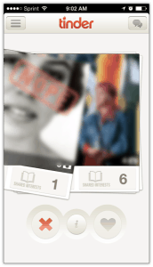
Tinder’s swiping mechanic is not dissimilar from the ever-present infinite scroll, popularized by Pinterest. What makes it so engaging? Both interactions – scrolling and swiping – require less effort than tapping or clicking a button and present visual queues to spike curiosity, furthering engagement. Each user profile is presented as a card amongst a seemingly infinite number of users. This metaphor manifests not only in its presentation but also the way in which it influences users to keep playing. The deck of cards is disorderly as the edges of hidden cards poke outside the stack, teasing the next profile. This instigates tension as users feel compelled to resolve their curiosity and continue swiping.
It’s not unusual for Tinder users to swipe through more than 100 profiles in a single session. Each swipe delivers immediate gratification, resolving the mystery of who will appear next. After all, the next one just might be the one. Users swipe right in attempts to satiate their appetite for social validation and discover if the object of their affection shares the same yearning. After each swipe, the next profile is fluidly revealed before the decision is cast.
Spreading Bets and Doing Work
Traditional dating sites require no further investment of the user to find a match once a profile is created. Tinder, on the other hand, makes its users work, impressing feelings productivity and accomplishment with each swipe. The only way to connect with someone is to use the service – both singles need to express interest before a match is made.
Each swipe to the right creates a match opportunity, immediately or in the future. Like a playboy who dates several women at once, spreading his bets, Tinder users increase their chances of getting lucky the more they use the service. This drives users to continue swiping, hoping their investment pays off.
Double Opt-In Dating
I met my (now ex) girlfriend on OkCupid. Prior to meeting her, I received very few messages from other women (they were probably too intimidated). Curiously, I asked her how many guys messaged her on the service. “I received over a dozen messages every day in the first few weeks,” she said. “I continue to get at least a few every day. I barely even look at them now.”
Her experience is very common. Men send a majority of messages to prospective dates online, creating a heavily lopsided market. This mismatch leads to burnout as women feel overwhelmed with interest from (often questionable) suitors and men feel disheartened from the lack of response.
Tinder solves this by making the connection double opt-in, requiring both men and women to express interest. This gives women the authority to decide who can send them a message and more control of their dating experience. Additionally, it avoids signaling feelings of rejection. When one sends a message with no response, they reasonably assume rejection. The more often this occurs, the less motivated the lonely man will be to continue sending messages and using the Tinder service.
In reality, Tinder is less a dating site and more of a game. The reward of finding a hot match isn’t what continues to drive engagement. It’s the anticipation of the reward that encourages users to keep swiping, scratching their curiosity to reveal what’s next.
Compare that to Match, eHarmony, and the rest, and which do you think would be more fun to play?
Related Articles
- Schedule Maker: a Google Sheet to Plan Your Week
- Cancel the New York Times? Good Luck Battling “Dark Patterns”
- How to Start a Career in Behavioral Design
- A Free Course on User Behavior
- User Investment: Make Your Users Do the Work
- Variable Rewards: Want To Hook Users? Drive Them Crazy
- The Hooked Model: How to Manufacture Desire in 4 Steps
