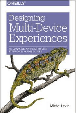
Nir’s Note: This guest post comes from Marc Abraham, a London-based product manager at Beamly. In this article, Marc reviews the recently published book “Designing Multi-Device Experiences” by Michal Levin. Follow Marc on Twitter or check out his blog.

We live in a world where the number of connected devices is growing on a daily basis at an immense rate, with people constantly switching between these devices (PCs, smartphones, tablets, TVs and more). The question arises how we can design optimally for a device to be used together with other devices.
Michal Levin, a Senior User Experience Designer at Google, has created a framework which aims to capture the interconnections between different devices. Levin calls this framework an “ecosystem of multi-connected devices.’ The underlying goal behind this framework is to enable designers and product creators to “understand the different relationships between connected devices, as well as how individuals relate to them.” As a result, companies can create natural and fluid experiences when designing for multiple devices for their users. Levin has written about the fundamentals of this ecosystem in her book Designing Multi-Device Experiences.
How does one build such an ecosystem of connected devices? What does a “multi-device experience” entail? A key ingredient is Levin’s “3Cs Framework”. The 3Cs are “Consistent”, “Continuous” and “Complementary” design approaches:
The Consistent Design Approach – Consistent design happens when the same experience and content offering is ported across devices. Despite the inherent degree of consistency between devices, adjustments will nevertheless still need to be made to adjust to different devices’ characteristics. Elements such as content offering and navigation can remain consistent across all devices whilst functional and visual optimisations can be made per individual device.
For example, Trulia – an online real estate mobile app for home buyers, sellers, renters, and real estate professionals – offers the following core elements as part of a consistent experience across all devices:
- Content offering – The entire set of Trulia’s property listings is available on all devices.
- Search bar – The search bar is consistently placed at the top of the app, irrespective of the device.
- Property details box – This is offered across all devices, and provides more details about the property in focus.

Fig. 1 – Screenshot of Trulia’s mobile app
Trulia has optimised a number of things per individual device type. For example, in the smartphone — which has the smallest display out of all devices — the Trulia app focuses on the product’s essence only: a map view of available properties with a price distribution layer. Everything else is displayed upon interaction (see image to the right).
The Continuous design approach – With the continuous design approach, the multi-device experience flows from one device to the next. Michal Levin describes this approach as “a user flow that runs along a set of contexts, during which devices “pass the baton” to one another until the user reaches her information goal or completes the desired activity”. There are two ways in which this continuous user flow can be broken down: a single activity flow and a sequenced activity flow.
With a single activity flow, activities such as reading a book or writing a document can be carried out throughout different contexts (e.g. at work, in bed or at an airport). The end goal remains unchanged; finish reading a book or writing a document. A good example of a single activity flow is the Amazon Kindle. The Amazon Kindle ecosystem enables users to have a seamless reading experience across multiple Kindle devices and Kindle apps.
In the sequenced activities flow, the user typically goes through a number of different activities to complete her end goal. These steps can be done in different locations, at different times and with different devices being available and/or most convenient for each activity. The fact that each step can be of a very specific nature or have a different duration, has an impact on the way we design for this continuous experience. A good example is Eventbrite, a product focused on organising and attending events. With Eventbrite, the typical user workflow consists of multiple steps and tasks:
- Register for an event – The user typically gets an event invite over email or through browsing. Typically, for the user to decide on registering for the event, she will want to read the event details (e.g. timings, location, etc.) after which she can complete the sign-up form.
- Attend the event – The user workflow related to attending an event tends to comprise a number of subtasks such as getting to the event and checking in at the event venue. Eventbrite’s mobile app accommodates for these tasks through features such as providing directions to the venue and offering a scannable barcode for a quick check in.
The Complementary design approach involves collaboration among multiple devices operating together as a connected group. Whereas the consistent and continuous design approaches center around a single device, the complementary approach is all about user interaction with at least two devices — usually simultaneously — at any given moment. There are two types of device relationships that can help achieve a complementary approach: collaboration and control.
- Collaboration – Different devices, each with its own distinct role, work together collaboratively to construct the whole user experience.
- Control – The user’s primary experience takes place with a particular device, while other devices control aspects of that experience, usually remotely.

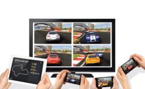
Fig. 3 – Sample Real Racing 2 Multiplayer
Additionally, devices can play different roles in the complementary experience. Devices can either be an integral part of the experience (‘must have’) or can be added to deepen the user’s experience (‘nice to have’). The book mentions the racing video game Real Racing 2 as an example of ‘must have collaboration’ between devices (see Fig. 3). Players of this game can use their smartphones to play the game on a tablet in front of them. Xbox Smartglass was (now discontinued) an example of a product where collaboration and control meet (see Fig. 4 below). A smartphone or tablet can transform into a second-screen companion to the Xbox Smartglass by automatically serving up extended-experience TV shows, movies, music, sports and games (nice to have ‘collaboration’). On the other hand, the smartphone, tablet, and PC can all control the living room Xbox experience (must have ‘control’).

Fig.4 – Xbox Smartglass
The remainder of Designing Multi-Device Experiences explores how to best measure the multi-device experience, tracking usage across all devices and understanding how users navigate through the product flow. The book ends with a chapter on potential challenges with respect to creating a multi-device ecosystem, identifying both challenges and potential ways to address them.
Michal Levin has written a very insightful and practical book, which should provide a lot of food for thought for anyone involved in designing or building a user flow which involves multiple devices.
Note: This guest post comes from Marc Abraham
Related Articles
- Schedule Maker: a Google Sheet to Plan Your Week
- Cancel the New York Times? Good Luck Battling “Dark Patterns”
- How to Start a Career in Behavioral Design
- A Free Course on User Behavior
- User Investment: Make Your Users Do the Work
- Variable Rewards: Want To Hook Users? Drive Them Crazy
- The Hooked Model: How to Manufacture Desire in 4 Steps
