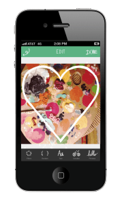
Nir’s Note: In contrast to last week’s post on the power of saying “no,” Eric Clymer shares how a creative attitude helped his team build a #1 ranked app. Eric was the lead developer of the “A Beautiful Mess” app and is a Partner at Rocket Mobile.
In improv comedy, there are really only two words that matter: “Yes, and.” You share a premise, form a scene, create a character, and if everything works out right, kill the audience. Then, you try and do it again with another, “Yes, and.”
Before I began developing for iOS, I performed stand-up and improv as a hobby. I never thought “Yes, and” would apply to the development of software and how to work with clients. But, in my best Louis CK voice, “It TOTALLY did.” This essay is about what I learned working with the artists who hired my company to create “A Beautiful Mess,” an app that went to #1 in the App Store 15 hours after its release (it’s still near the top of the app store).
Elsie Larson & Emma Chapman, the creators of the do-it-yourself blog ABeautifulMess.com are amazing at what they do. Over the past six years, their mix of recipes, photography projects, and other fun arts and crafts ideas, have amassed them a following of over 1.5 million visitors per month.
They came to my company with the premise for a “cute photo app that you add little sayings or doodles to your pictures and share them with friends.” I’ll bet no developer reading this has ever seen “doodles” on a requirements document, let alone it being the only requirement on a non-existent requirements document. When we started the project, I immediately reverted to a character I call the “Defensive Developer.” This character says things like, “We need requirements! There’s a ton of photo apps! What if they want to add on things? It could TOTALLY mess up my architecture! I mean we’re building a house here people!” Defensive Developers love the house analogy by the way. Unfortunately, the Defensive Developer shtick gets old. If he were on stage, his four to six minutes would be joyless and painful.
But this was a role I had played before and so sought comfort in what I knew. I was nervous. “What do artists know about software,” I thought. These women make scrapbooks and cupcakes. How could I possibly explain to them a navigation stack or view hierarchy?

There are times where “no” is appropriate however. “No” creates a framework through which you can move onto “yes, and”. In fact, you can’t say “yes, and” without starting with “no.” In improve comedy, establishing the premise is how you say “no”. For example, if an improve situation begins with, “You’re a lawyer who’s interviewing for a job,” the comic must go with it. If something occurs outside the constraint, say for example the actor pulls out a stethoscope, the audience will know the premise has been violated. A proper “no” creates the boundaries within which the performer can thrive.
While creating the app for A Beautiful Mess, the period of “no” was brief. The premise of “photo sharing that lets you add texture and content over your photo,” was strong and we went with it. “No” was only used to limit scope and focus the product. “What about a social network of scrapbooks?” — no, that dilutes the product. “What if you could make your own doodle?”– no, that takes away from A Beautiful Mess’s brand. Once we agreed on our basic premise, the process of improvising features and design through “yes, and” was natural.
One particular feature that was internally driven by “yes, and” was what we call our “Intro and Outro” screens. In early versions of the app, the user was dumped into the photo editing view. We needed a way to bookend the creative experience because the user had no real way of knowing what to do next. Users were unsure if they were supposed to select a photo, a background, or just start editing an empty canvas. So we started riffing:
“Can we make it more clear how to get started?” — “Yes, and…”
“Can we make getting started look more like Elsie & Emma’s brand?” — “Yes, and…”
“Can we make the end of the editing experience just as branded and clear?” — “Yes, and…”
“Can you share your creation or start over from the same Outro screen?” — “Yes, and…”
“Can we make the transition from Outro to Intro seamless and one-touch?” — “Yes, and…”
When we were done, we had a clear start and finish to a much better user experience. More importantly, we found our recipe for success.
After a couple months of what became collaborative riffing, requirements emerged, design and development sessions ensued and ultimately, we came out with a beautiful product. In contrast to my Defensive Developers act, a new, much more enjoyable character emerged. He’s much more popular with audiences. People like watching him overcome new challenges. He’s imperfect, flawed, and has a lot to learn, but because he doesn’t get scared and start saying “no”, he gets a lot more laughs.
Note: This guest essay was written by Eric Clymer
Related Articles
- Schedule Maker: a Google Sheet to Plan Your Week
- Cancel the New York Times? Good Luck Battling “Dark Patterns”
- How to Start a Career in Behavioral Design
- A Free Course on User Behavior
- User Investment: Make Your Users Do the Work
- Variable Rewards: Want To Hook Users? Drive Them Crazy
- The Hooked Model: How to Manufacture Desire in 4 Steps
